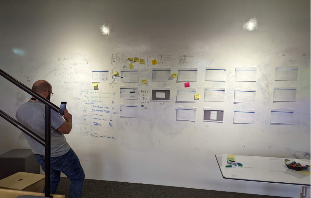
Showcase planning workshop
A look at the final result of the planning workshop done with the Showcase team and a select number of key stakeholders to ensure project alignment.
The Showcase website plays a pivotal role in Learning Pool's sales pipeline, serving as a platform for exploring both off-the-shelf and bespoke e-learning content. Originally built on top of an LMS instance, the site was constrained by a complex interface, limited customization, and a rigid structure that made content exploration cumbersome for both customers and internal sales teams. This redesign project aimed to reimagine Showcase as a purpose-built, customer-facing site with a simplified content structure, improved navigation, and enhanced visual presentation. By removing the LMS constraints, we could focus on delivering a clean, intuitive user experience designed around real sales workflows and content discovery needs.
Timeline: 4 months
People: Customer Success, Content Lead, Product Owner for Showcase
Role: Lead UX Designer
Conducted collaborative workshops with the Showcase and Sales teams to identify frustrations and usability issues.
Mapped user pain points around navigation, onboarding complexity, and content discoverability.
Created lo-fi sketches and grouped content using a two-level structure of Collections and Lessons.
Built grayscale mockups and established a reusable component-based mini design system in Figma.
Conducted two remote usability group sessions using Lookback.io with sales representatives.
A look at the final result of the planning workshop done with the Showcase team and a select number of key stakeholders to ensure project alignment.
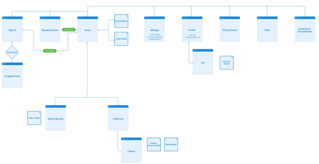
An example of the navigation flow for the Showcase site. This flow represents the initial design, which evolved through several iterations based on continuous feedback and testing.
Sales teams struggled to onboard users due to automatic content assignment.
Customers couldn’t browse the full catalog and often needed direct links from sales teams.
The site lacked a consistent visual identity aligned with Learning Pool’s brand.
The LMS-based Showcase website was confusing to navigate, difficult to administrate, and poorly aligned with the Learning Pool brand. Users often dropped off or became overwhelmed due to automated onboarding and disjointed content discovery.
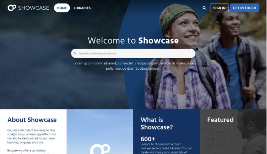
We replaced the LMS with a standalone experience focused on simplicity, branding, and structure. The redesign introduced a two-tier content model (Collections > Lessons), image-led design elements, and a clearer information architecture to help both sales teams and customers engage with content more effectively.
We aimed for a visually inviting, brand-consistent design that prioritized discoverability and responsiveness. The layout emphasized reducing friction and increasing scannability across devices while maintaining consistency with Learning Pool’s design system.
Image-led content tiles with accessible scrims
Mobile-first layout with optimized collection views
Reusable Figma components and mini design system
Grayscale wireframes evolving into high-fidelity prototypes
Tag-based filters and clear calls to action (CTAs)
Users initially struggled with understanding the filter options.
The tag-only third level of content proved undiscoverable.
Participants responded positively to the simplified layout and strong brand visuals.
Introduced a third content level accessible via navigation rather than tags alone.
Redesigned filters to be visible and more intuitive.
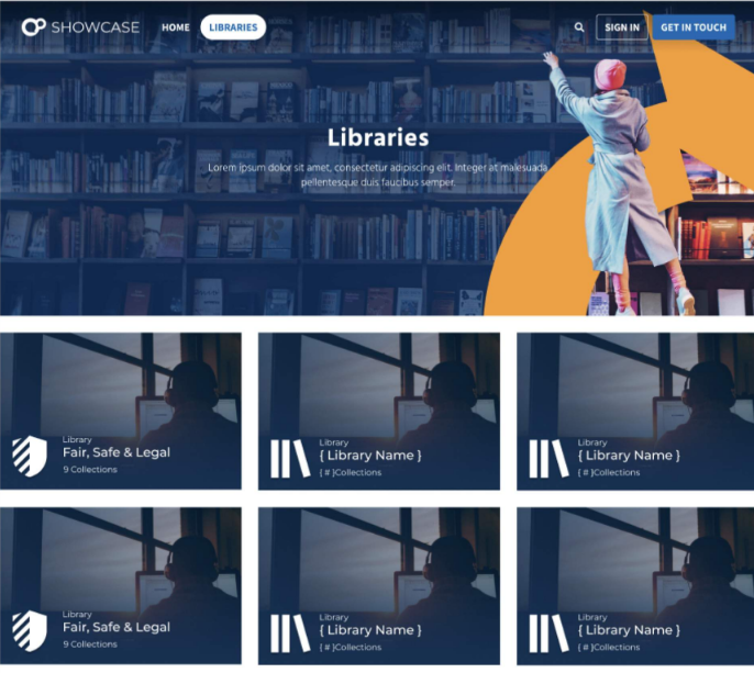
Added a new 'libraries' view for enhanced navigation.
Improved mobile interactions, particularly for collection tiles.
15% increase in sales within six months post-launch.
50% reduction in time required to complete a sale.
Improved cross-department collaboration with the UX team.
Internal recognition from C-suite leadership.
Increased inbound UX support requests from other departments.
Iterating with real users was critical to the project’s success.
Cross-department collaboration enhanced visibility and stakeholder buy-in.
Early usability testing guided key structural and navigational improvements.
Explore multilingual onboarding for international users.
Introduce curated content lists shareable across teams.
Implement personalized user accounts based on browsing and engagement patterns.
I'm always excited to take on new challenges and collaborate on meaningful projects. Let's discuss how we can create something amazing together.