Project Overview
The LXP Dashboard redesign aimed to address growing concerns from sales and enterprise customers around usability, scalability, and visual design. The existing dashboard was often described as outdated, cramped, and unintuitive. Leading to lost bids and poor learner engagement. Our objective was to overhaul the user experience, focusing on navigation, content prioritization, and user actions, all while operating within the constraints of the existing platform architecture.
Meta
Timeline: 6 months
People: UX Team, Bids Team, Customer Success, Stakeholders
Role: Lead UX Designer
Design Process
Empathize
Conducted deep-dive interviews with Sales, Support, Customer Success, and internal stakeholders to identify core frustrations and business risks.
Define
Mapped out three critical user experience gaps: navigation scalability, content discoverability, and hidden or unclear content actions.
Ideate
Explored design solutions that would remain compatible with the existing API and platform while delivering a more modern and intuitive experience.
Prototype
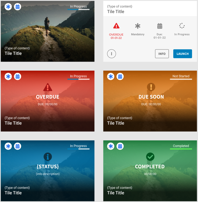
Developed vertical navigation, redesigned content tiles, and an action-enhanced hover state with dedicated Info and Launch buttons.
Test
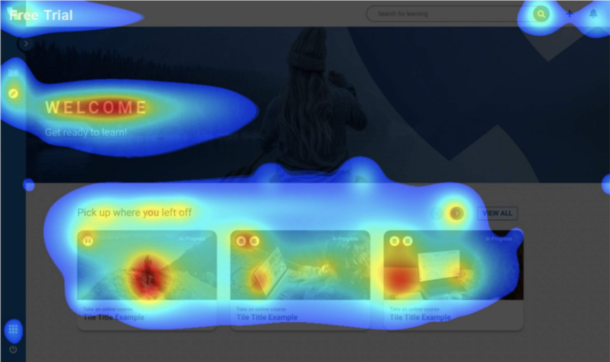
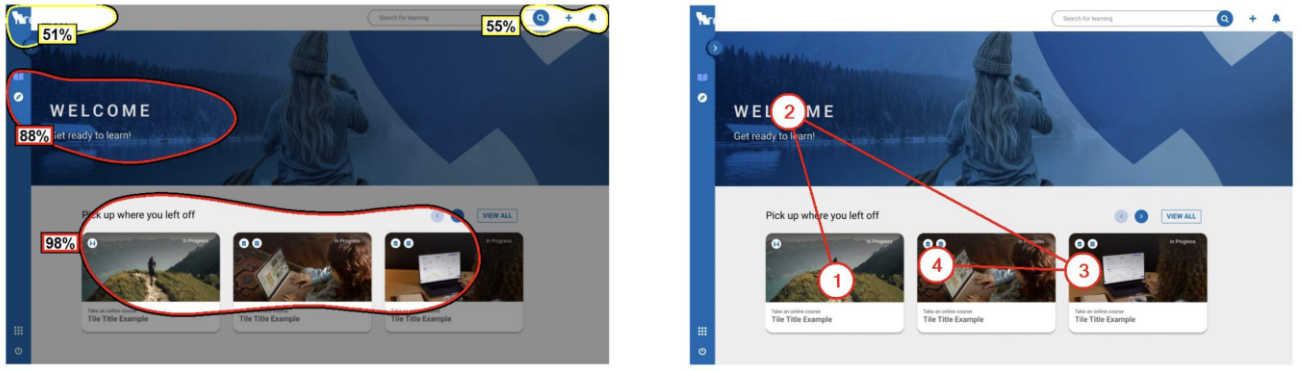
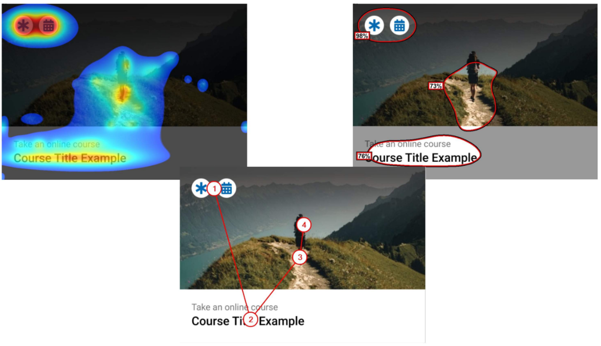
Tested design iterations via Figma prototypes and 3M eye-tracking tools to validate performance and usability gains.
User Research & Insights
Research Methods
Stakeholder Interviews
Usability Testing
3M Eye Tracking
Customer Feedback
Amplitude Statistics
Product Report Analtyics
Key Insights
Introduce contextual app surfacing based on user roles or behavior.
Add custom link capability for admins to expand their workflow tools.
Allow non-purchased apps to be displayed as upgrade opportunities.
Explore usage data from Stream Hub to personalize app access further.
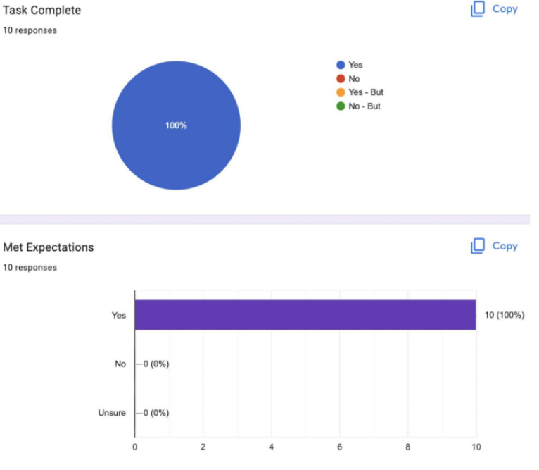
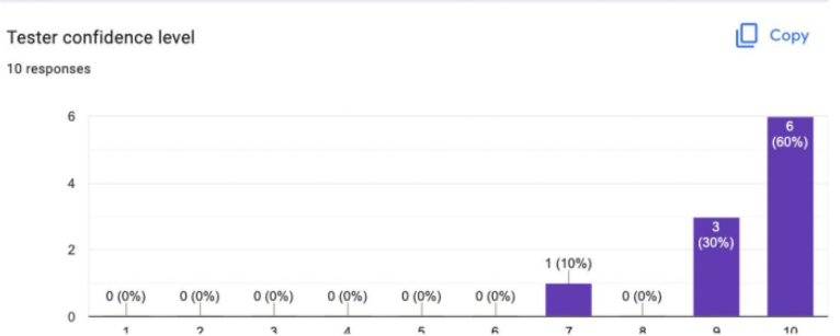
LXP task complete results
These results show how the tasks completion for identifying and opening the correct content was not successful and very inconsistent. This is just one piece of a much larger test that was conducted on the usability of the LXP. This result stands out the most as identifying and opening content is the simplest and smallest required action on the LXP.

Challenge & Solution
Challenge
The outdated dashboard UI led to poor content discovery, low engagement, and ultimately lost enterprise bids. Navigation was cramped, content was overwhelming, and core actions were hidden or unclear.
Solution
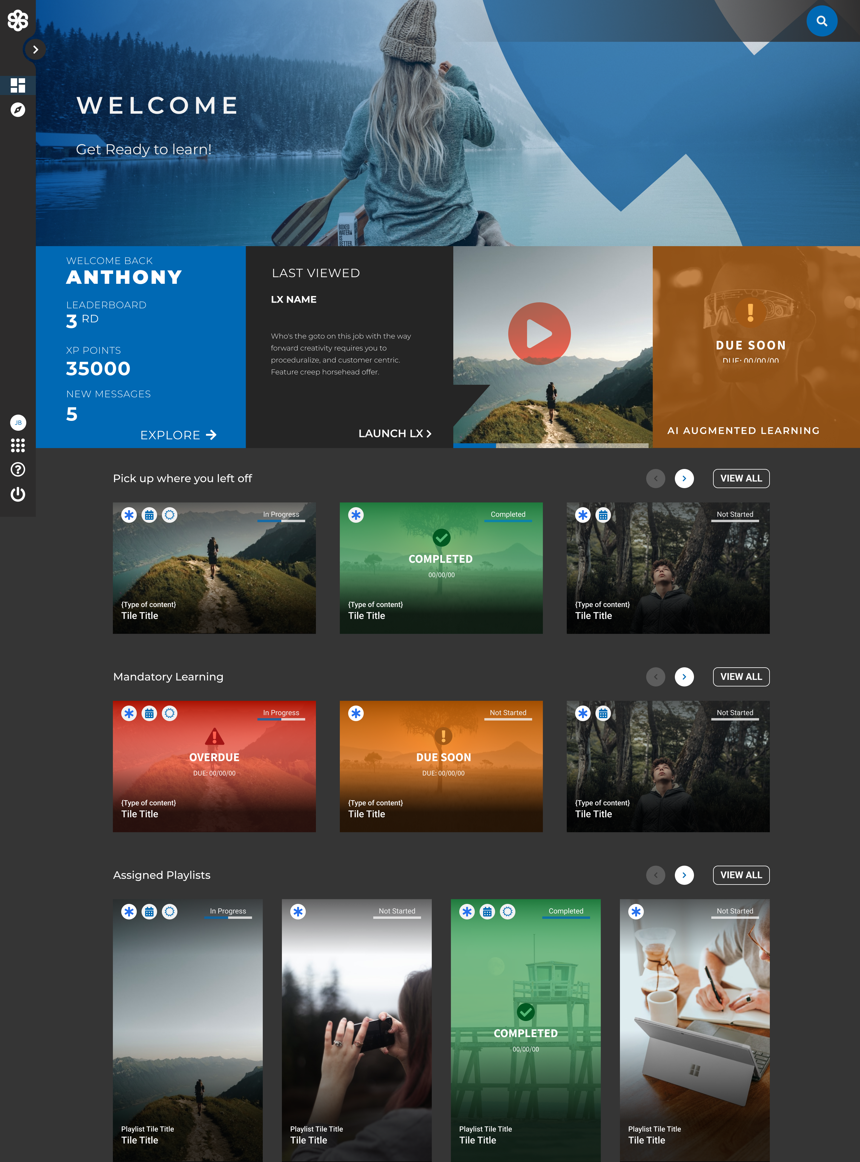
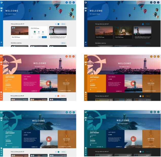
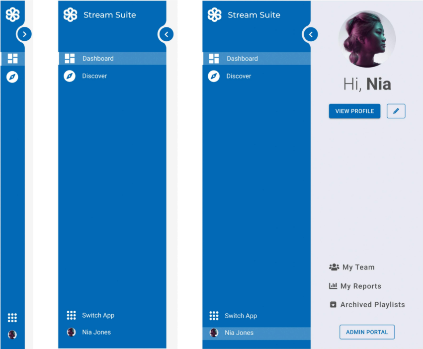
We introduced a scalable vertical nav, simplified tile interaction with a hover state for context and action, and implemented configurable theming. These changes maintained compatibility with the existing tech stack while delivering significant UX improvements.
Visual Design Approach
The visual strategy focused on clarity of content, improving navigation and content hierarchy and making the platform scalable to varying customer needs. This required the dashboard to be redesigned keeping in mind future feature improvements and ensuring visual consistency when dealing with customer branding and imagery.
The following is a list of the major changes made to improve the LXP.
Key Design Elements
Scalable vertical navigation with clear labels
Simplified tile interactions and hover states
Dedicated action buttons for Info and Launch
Theming options including light/dark mode and brand color tokens
Responsive layout optimized for both web and mobile devices
Two distinct styles—one prioritizing absolute accessibility, the other exuding luxury.

Testing & Validation
Testing Methods
3M Eye Tracking
Figma Prototypes
Maze Tests
User expectation testing (in person - Moderdated)
Customer Feedback (Live Event)
Key Findings
Vertical nav improved discoverability of dashboard sections
New tile interactions reduced mis-clicks and task completion time
Participants preferred action buttons on hover over previous sidebar interaction
Customers at Learning Pool Live responded positively to the updated design and requested early rollout
Results and Impact
Changes made
Adopted vertical navigation to support expansion
Replaced confusing tile layout with simplified, informative hover states
Enhanced accessibility with inclusive font and WCAG 3-compliant contrast
Introduced customizable theming for enterprise branding
Outcomes
Marked reduction in support tickets related to content actions
Improved internal confidence during customer demos and sales bids
UX team praised for cross-product design system efforts
Early reports from Sales indicated improved customer sentiment
Key Learnings
Conversations with Sales and Support revealed blind spots in our initial assumptions.
Accessibility and theming were not just nice-to-haves—they were deal breakers for enterprise clients.
Testing even within technical constraints leads to measurable UX gains.
Future Opportunities
→ Expand vertical nav patterns across other products for a unified design system.
→ Continue improving tile performance and transitions based on user feedback.
→ Evaluate the new dashboard against usage KPIs to inform next phase of improvements.
→ Introduce more powerful personalization tools for learners within the LXP.
Interested in working together?
I'm always excited to take on new challenges and collaborate on meaningful projects. Let's discuss how we can create something amazing together.