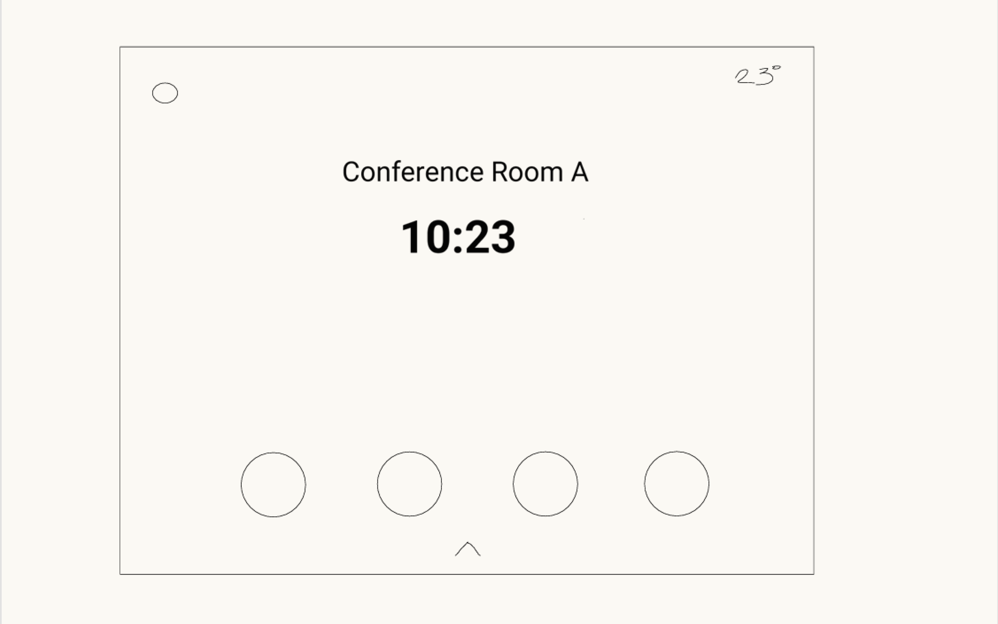
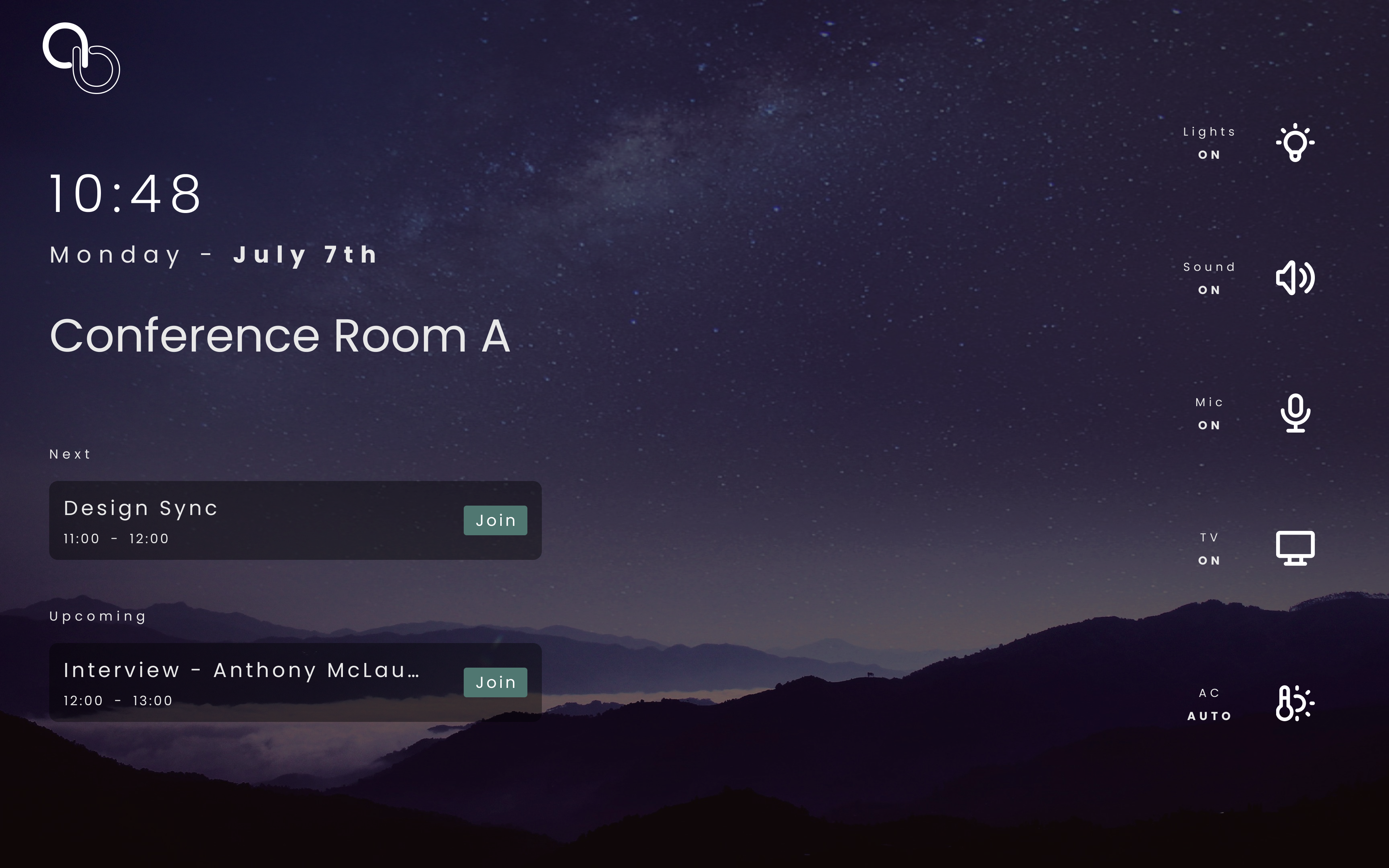
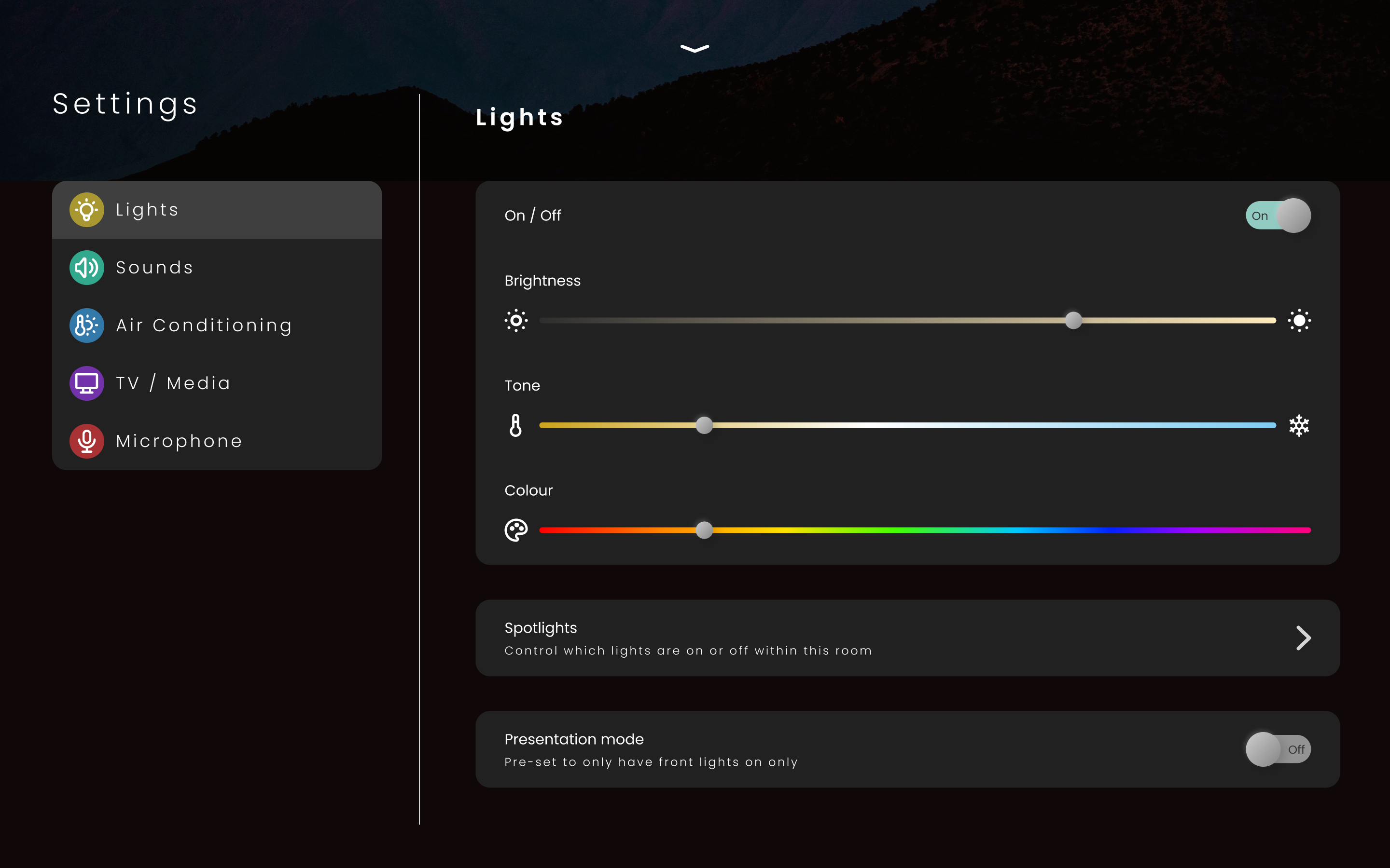
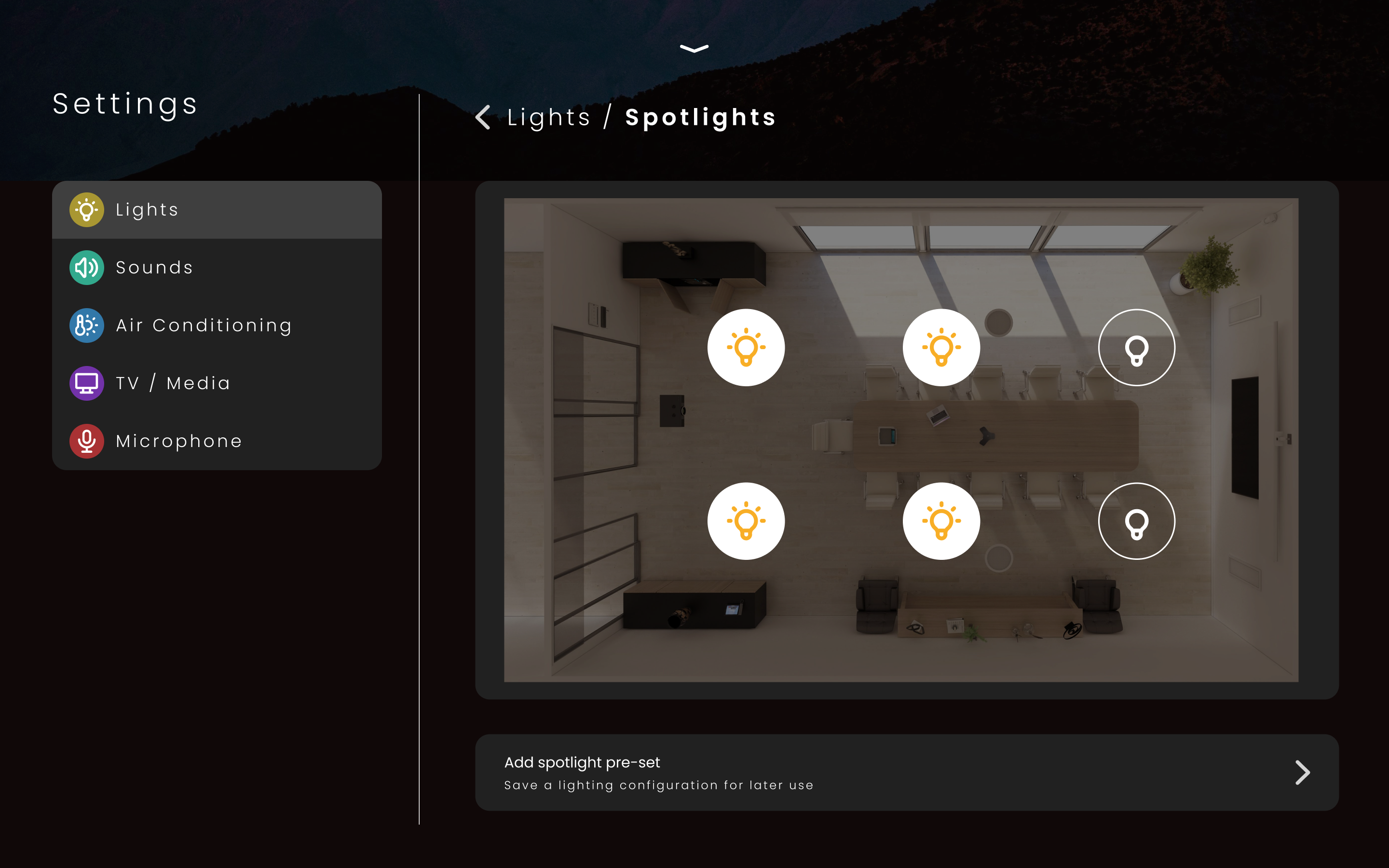
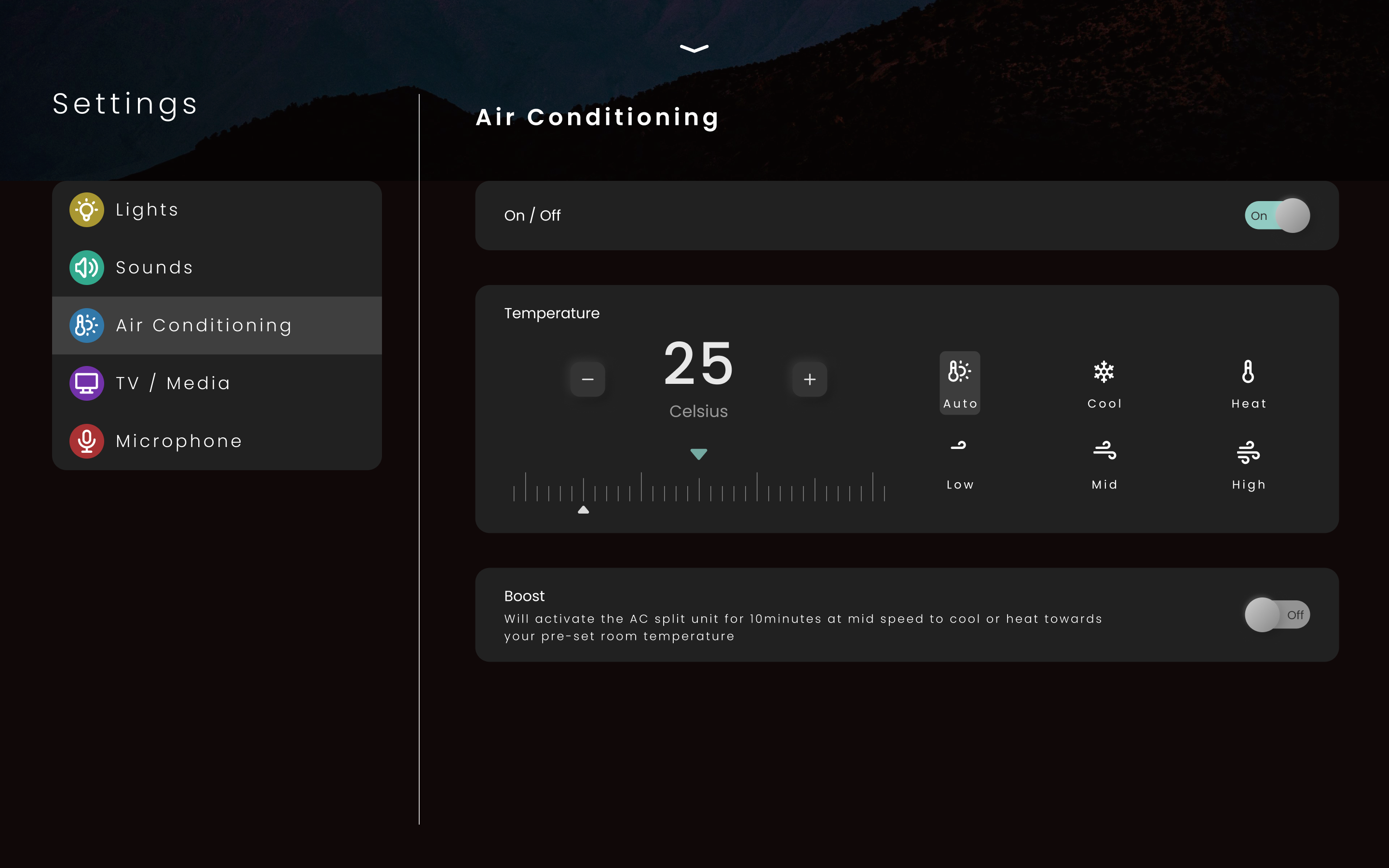
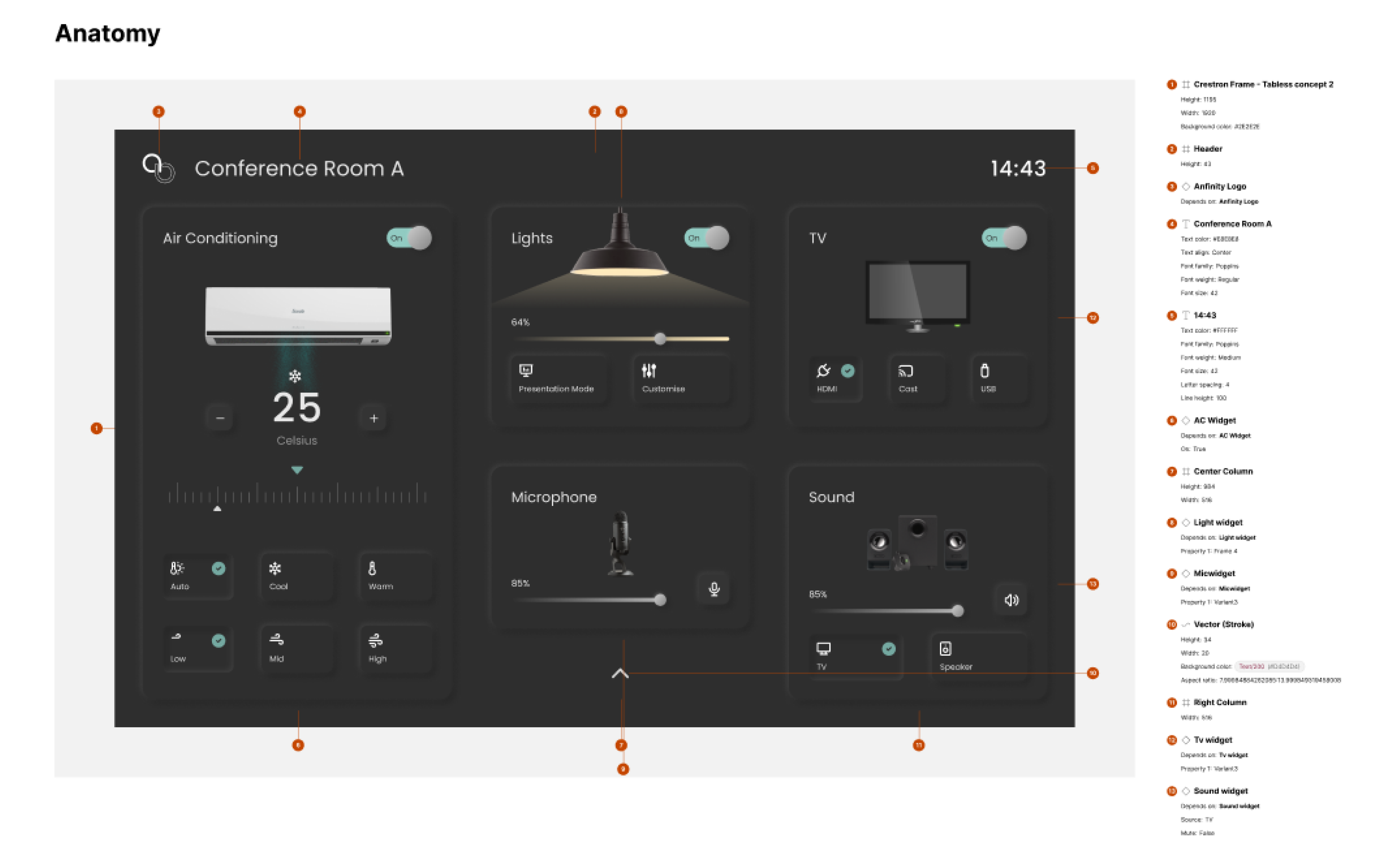
In the final concept submitted, I refined the layout to achieve a more balanced and visually stable composition. Placing the room controls along the horizontal axis created greater flexibility for future controls, offering more scalability than a vertically constrained layout. The room details—such as name, date, and time—were given improved prominence and hierarchy, making them easier for users to identify at a glance. Control label height was also increased to enhance readability, addressing earlier feedback that text appeared too small in previous iterations. The meeting scheduling feature was intentionally removed, as it was not part of the original brief; however, space remains available in the central area should this functionality be required in future iterations.