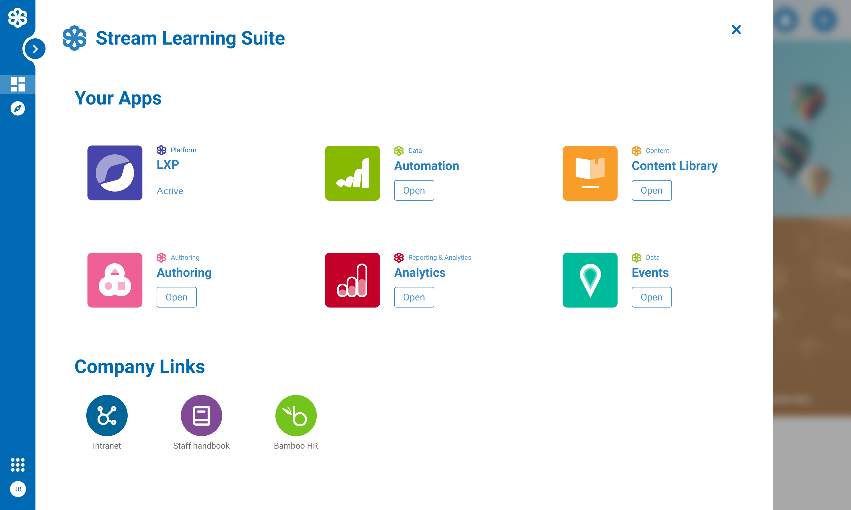
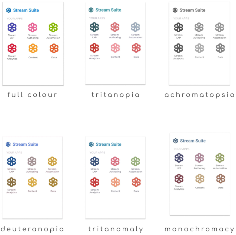
Project Overview

The App Switcher project was initiated to provide a seamless, centralized way for users to move between Learning Pool's suite of applications. With 15+ apps in the ecosystem, each requiring separate logins and no native navigation between them, users faced unnecessary friction. This project introduced an app switcher component integrated across platforms, backed by a shared design system and single sign-on functionality to deliver a unified, user-first experience.

Meta

  • Timeline: 5 months (initial release)

  • People: UX Team, Marketing, Engineering, Stakeholders

  • Role: Lead UX Designer

Tools & Technology

Figma Rails 3M Eye Tracking BrowserStack Internal CMS

Design Process

Empathize

Collaborated with internal stakeholders and customers to understand multi-app usage pain points and login frustration.

Define

Mapped access issues, user roles, and scaling challenges across customers with varying permission sets and app access.

Ideate

Designed an MVP experience focusing on visibility, brand-agnostic identity, and internal-only SSO testing with a phased rollout plan.

Prototype

Developed grayscale wireframes evolving into high-fidelity mockups, including future-state responsive UI and logo concepts.

Test

Conducted internal usability testing, Marketing reviews, and external feedback sessions including Learning Pool Live attendees.

User Research & Insights

Research Methods

  • Workshops

  • Stakeholder Interviews

  • Internal & External Feedback

  • Event Observations

Key Insights

  • Many users were manually bookmarking and logging into each application daily, revealing friction in accessing the ecosystem.

  • Users experienced confusion when app icons lacked distinctive branding or relied solely on colour differentiation.

  • The small coloured dots on each product icon were often mistaken for notification indicators, leading to further misunderstanding.

  • Administrators, rather than learners, were the primary users of the app switcher - shaping a more persona-focused design approach.

  • Marketing's rebrand guidelines significantly influenced icon recognisability and accessibility, underscoring the need for closer cross-team collaboration.

Challenge & Solution

Challenge

With no central place for users to view or access their applications—and rebranding constraints removing names and icons—users struggled to navigate the ecosystem effectively.

Solution

We built an SSO-powered app switcher embedded across apps, featuring scalable UI and accessible iconography. A compromise between Product and Marketing allowed icon/name usage in product UX while preserving brand intent.

Visual Design Approach

The UI design evolved through multiple stages—from grayscale popovers to branded, responsive components. A balance was struck between brand minimalism and product usability.

Key Design Elements

  • Popover UI with app grouping by function

  • Accessible, color-independent visual identifiers

  • Stream Suite naming and labeling conventions

  • Mobile-first responsive implementation

  • Logo concept exploration with cross-team workshops

Testing & Validation

Testing Methods

  • Internal Alpha Testing

  • Customer Beta Feedback

  • Event-based Observations

  • Icon Learnability Mockups

Key Findings

  • Popover needed to scale visually for customers with many apps.

  • Customers misinterpreted color dots on icons as notifications.

  • Users preferred named labels and app grouping despite branding restrictions.

  • Workshop-driven icon exploration resulted in higher recognition rates.

Results & Impact

Changes Made

  • Implemented SSO across selected apps with app switcher integration

  • Introduced branded-but-accessible icons and labels post-marketing collaboration

  • Designed a shared dialog component used both inline and within the vertical nav

  • Created space within Stream Hub for app switcher management

Outcomes

  • Positive user sentiment from customers and internal users

  • Improved login workflows and reduced support requests

  • Streamlined app discovery, especially for admins

  • Enabled feature scalability through the shared design system

Key Learnings

  • User access to multiple products is highly fragmented without shared UX conventions.

  • Branding decisions need to be tested for accessibility and usability.

  • Customer feedback—even from small interactions—can uncover major UX wins.

  • Design systems help ensure long-term consistency across evolving platforms.

Future Opportunities

  • Introduce contextual app surfacing based on user roles or behavior.

  • Add custom link capability for admins to expand their workflow tools.

  • Allow non-purchased apps to be displayed as upgrade opportunities.

  • Explore usage data from Stream Hub to personalize app access further.

Interested in working together?

I'm always excited to take on new challenges and collaborate on meaningful projects. Let's discuss how we can create something amazing together.